Thursday, December 10, 2015

Silvermask Not Jaller comic

A very basic comic to make a point of something. By simple I mean no editing of background or eyes. 

"Silvermask Not Jaller" is a comic that expresses Silvermask's feelings (more specifically mine) about looking so much like Jaller Ignika because his body is the same, details about this dilemma explained on the Silvermask Darkness post. Back when I shared the posters of him, I found a majority of comments from others irritating and typical, feeling peeved by the fact no one bothers looking at the posts which state clearly things they felt a need to repeat.

Irritating as that was, it did inspire this comic which became a laughable thing to me, especially the final panel.
 
Yes, Silvermask decided to take his friends advice and wear some silver accent armor, his mooning of Takanuva a way to express my feelings towards the past comments made on his darkness posters. 

I do plan on keeping the silver accents on him to help him be identified more as his own character. This will be for when one day I hopefully make the Seawing comic.

This comic also explains that in the Seawing world, her friend Uma is in fact the Hewkii Ignika set, but in this dimension he's the twin brother of Hewkii.

The concept of Takanuva mistaking Silvermask as Jaller and wondering what dimension he's in when Uma (Oo Ma) says he's Hewkii's twin, can also connect to the random ideas of Takanuva's Travels.

Sunday, December 6, 2015

Gresh Pin-up

 Just a little joke that connects onto a recent mini series of images for Valentines Day (yes I started early). Gresh pin-up, AKA, sexy Gresh, is a simple last minute idea of nuttiness. :P

For those who wonder, I came to do this image after being influenced by the Gali and Gresh series, a Saronicle production. But there are a few other things this connects to, such as the Life of Lewa series, only instead of Gresh it would be a guy named Kaziki, on the rug. Trivia is that I've always found Gresh's character to be charming, and his set build on the attractive side (minus the skinny legs).
He kind of shifts to get comfy for the second angle. XP Background is scrapbook paper, flooring is an old T shirt covered with a rabbit fur pelt to serve as the fur rug.

Thursday, December 3, 2015

Into The Sunset

"Head Low Ero"

Newest collection of images to express something deep and almost unexplainable.

Don't be fooled, this doesn't represent Axalar Lewa, but instead my character Erozion, walking down a concrete road at sunset, his head low and his stride less upbeat as he carries his backpack towards home.
Why is he sad? In story line sense there could be many reasons, but these images also represent something deeper.
They represent the resentment of leaving old stories behind. This refers to the Life of Lewa series. This doesn't mean the Life of Lewa series is being completely forgotten, it's just being pushed to the very bottom of the writing list.

Enchanting as the story is to me and a select few, I find I struggle with certain aspects of it, the main one being how old it is, and the fact that it connects with memories in real life that have slowly faded away and have left my emotions dead towards certain aspects in my life as of today.

Without someone to share with daily, a story like this becomes lonesome and loses enchantment, especially because I work best when inspired by those who like what I'm sharing. The feeling of inspiration and the spark of enchanting imagination is lost when familiar faces that encouraged me are no longer reliable or available for whatever reason, life always changing for better or worse.

There's also the drag of people mislabeling a character just because they can't seem to notice subtle differences in the build of something, and therefore kill the mood by saying isn't that what's his name? Instead of looking more closely at the description.
These two images are some of my favorites, the second one really holding the mood I was aiming for.

Like any mood, things can change, be it "Into the Sunset" (left) or "Hello Head High" (right).

On a final note, this song fits the inner mood and scene of the character, helping me better express my emotions through the art.

Wednesday, November 11, 2015

Lunch Buddy

"Lunch Buddy"

Those times where day dreams are small, but sweet. Not sure why I dedicated my time to such a small concept, but the theme just moved me.

This image relates to a possible moment in the Pearllight Origins story or in an alternate dimension concept. It came from a day dream of a little girl trying to see what's on the counter, hungry for lunch and trying to get a peek at what's being made. This idea then mixed with the thought of how being around a Toa can make you feel like a child when they're so tall and you're on the short side, this feeling being partly how Pearllight feels around them when not in armor. So here she is trying to get a look at lunch, feeling as a child as she gets on tip toes to see what's happening at the kitchen counter built for a giant.

Creating the environment of a Toa's kitchen was kind of fun. I tried to keep things looking efficient, while also showing it's still tribal and island like. Lots of wood and organic materials, iron pans, ceramic bowls and jars, a cob oven with stone top stove, and preparation of food being done on a very large leaf since this home is either in the jungle, or somewhere near the beach.

Who the green guy is...I'm not sure. My original day dream was Lewa, but then I felt it should be someone else, partly because I draw Lewa so often, and his mask is hard to draw from behind. Perhaps this character is one of his friends, or maybe his form morphed temporarily. :P

One thing I did enjoy was designing the clothes on Pearl; the colors make me happy. The thing I'm more iffy about is lighting and shading.....I feel a need to improve in that area, but still lack some experience for it.

Saturday, November 7, 2015

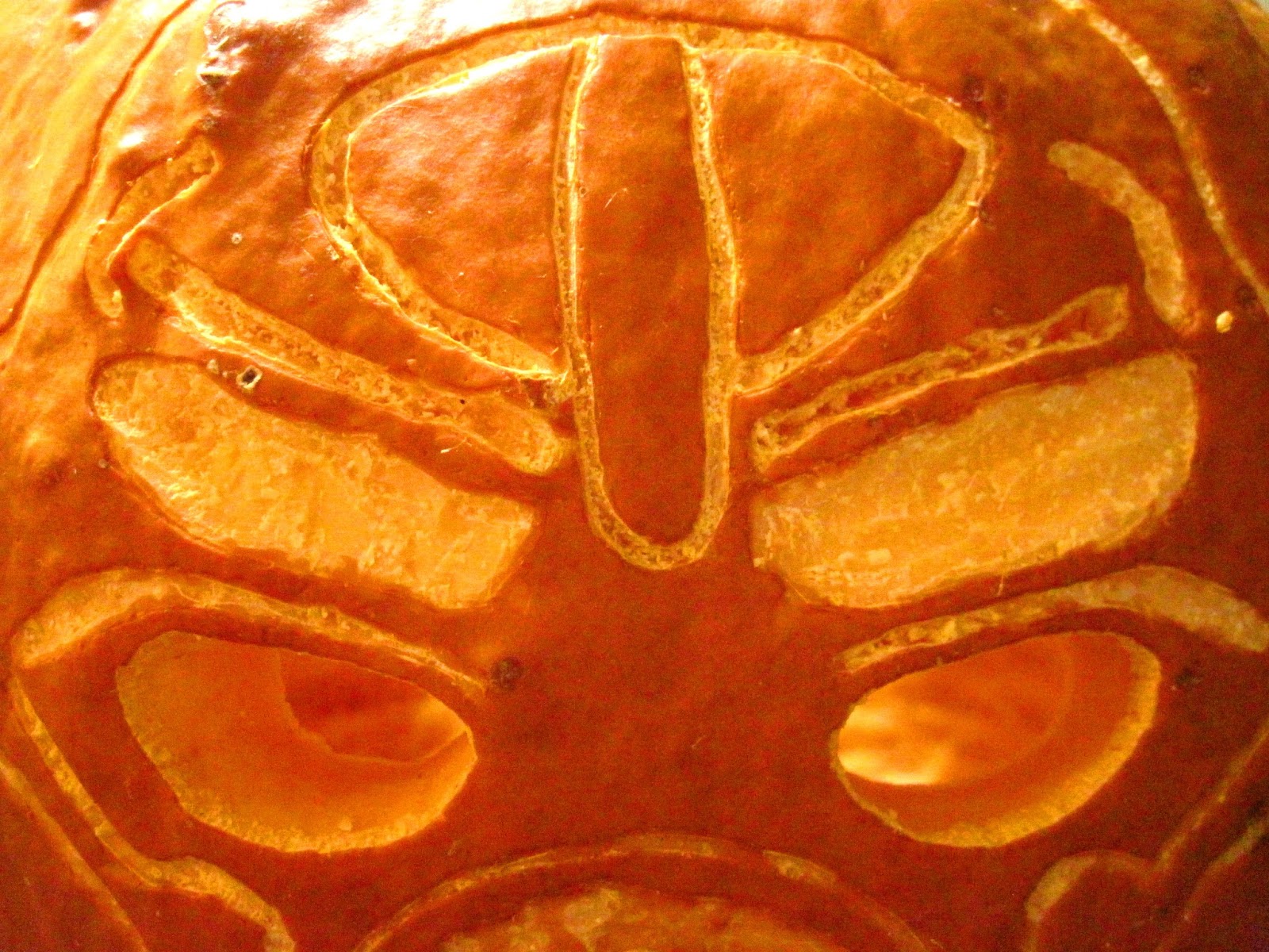
Hau Nuva Pumpkin

 I'm so happy to have this made. :) It seems I do a pumpkin carving every two years, and always after Halloween has passed. :P I listed the stencil for the Hau Nuva back in 2013, and now I've gotten to make my fourth Bionicle themed pumpkin.
 This year it only took several hours to make my carving from start to finish, the most time spent on scraping out a large amount of flesh from the inside since my details weren't the deepest, and carving deeper became difficult seeing the woodcarving tools are becoming dull. Total time minus breaks I'd guess about four some hours.

 Thankfully the camera still managed to pick up on the faint glow, my favorite picture being the one above with the illusion of an outlined mouth and eyes that appear to have glowing pupils.
Of coursse a side view of both cheeks is a fun way to show off details.
 The main thing I noticed was the heat coming off the two small tea candles placed inside. It made me amused and I had a day dream where I'm snapping pictures of the hot Tahu. xP

I'll admit, it was awkward too, I blew out the candles through his mouth hole because I didn't feel like turning the whole pumpkin around. My mothers side remark, "Must be the French way". :P I did find it oddly amusing.
Here's a view of it with lights on. Fun trivia, I didn't choose the pumpkin, it was brought home to me, which means it had some warts and blemishes I found a way to incorporate into the piece.
Note, Tahu has some warts (left). XD But the blemish I found was even more amusing is the mark on his left cheek (middle and right). This was a rough spot in the pumpkin, a bit more wood like and difficult to carve. 

I purposely placed the stencil around the area in such a way that it served as a partial infection beginning on his Kanohi from the poisonous scratch he received in the movie. This mark just coincidentally ended up on the proper side of his mask just like in the film. An infected and grouchy Tahu is a great scary theme if you ask me. ^.^

I noticed this particular carving pumpkin was rather dry compared to ones I've worked on in the past. I believe that's partly the reason it was more difficult to cut.
You can see here the close up details, notice how dry the flesh is, even after only briefly sitting. Cutting the eye holes and mouth was the final step, and then it was candle time.

Thursday, November 5, 2015

Big N Tall Shopping comic

 Some of you may recall the Big N Tall Shopping image included in this comic. Funny questions followed about what the other three Toa would be wearing, several of those questions pertaining to Kopaka. His first shirt quote was a suggestion from someone on Google+.

All the shirt designs in this comic were fun to design, especially Onua's. All the other shirt quotes were just a result of my zany brainstorming.

A joke had followed about Kopaka, people wondering where he was. For one moment I thought he might not be there at all, and preferred the coffee shop in the mall, which connects onto the other comic strip "No Mask, No Service". I decided though that I'd include Kopaka somewhere, and the comic developed from there, the fancy suit idea coming from a conversation on Deviant Art with a fan of my work. :P
The rest of the comic melded out into a second page where I found a way to combine a few day dreams once separate ideas, into this comic. Turaga Files and Tie Time Lewa were both separate at one point in my sketch book. Gave me a good excuse to add more puns to my pages. :D

Tuesday, October 13, 2015

Lewa and Pearl

Lewa and Pearl, an experiment to test out my accuracy height chart created one night on a scrap piece of paper. My curiosity needed to be fed, to know the mysterious question of how tall in accuracy in comparison to myself is a Toa, and what does that look like? 
After some sketching and mathematical irritation, I got two concept charts of measurement, the first experiment on the left, and the second main chart on the right. After finding a way to convert feet and inches into a smaller scale of accuracy on paper, I found Toa are pretty big, but not as huge as some may visualize in comparison to a human. I used this graph as a guide to create a photo of Lewa from the Life of Lewa universe (it's an alternate world) standing next to Pearl (me). As you can see above, a Toa is rather large compared to Pearl, but not as towering as some may think. If Pearl were to give Lewa a hug, her head would at least snuggle nicely against his belly. Granted, I wouldn't want to be chased by something like this...especially not after looking at the size of Lewa's feet, finally seeing they are indeed the size of half my torso.
This specific image of Lewa has been in line for years to be made into a poster for Life Of Lewa, so I went ahead and made a stand alone image to give him the spotlight. As mentioned, this build of Lewa stands for his more jungly self in the Life of Lewa series.
I made cropped versions of these as well, to focus on the scene more.

Side note, Lewa and Pearl either met at this spot to talk, or they're heading for some place in the jungle. Lewa going for a walk willingly...what madness is this? O.O

An artistic experiment of the pictures created on Jan. 2, 2018.

Writing from the future, I wanted to make these pictures feel more natural, as though they were paintings in a journal instead of photographs which have been merged together. I go into more detail about the subject of converting a photo manipulated image into something that looks painted in the PS paint filter experiment post on my main blog.

I like the idea of painted looking images, because I feel that if I were keeping a journal in a fantasy setting, there would be a more likely case of having painted images on a page over actual photographs which require a camera.

On January 2, 2018, I went back to the Youtube video I had watched before on how to make an image look like watercolor, and I got this. It's not too bad, some details are of course lost, but I like the way it turned out.

I made a few duplicate layers of my image in PSE, one of those layers I applied a cutout filter to, then took that image and applied a smart blur to it. I then created a copy of this layer, reverted i,t and turned the blending mode to color dodge. On this layer I painted over it using a watercolor brush set to 9% opacity. Once the painting was done, I duplicated my layers, merged them, and applied a sandstone texture through the texturise filter.
Created Jan. 3, 2018

Only difference between this version above and the ones below are the slightly darker edges which give the picture more of a 'drawn with pen' appearance.

After a basic watercolor effect over a cutout filtered image, I played around further with the images from this collection the following day, and discovered a technique I really like the look of.

I wanted more detail while still having a watercolor effect that made the images blend together and appear like an actual painted illustration from a story book.

To achieve this I took my base photo manipulated picture, duplicated it, and applied a colored pencil effect from filters. I then set this layers mode to lighter color. Beneath this layer I created a solid color layer of dusty dark brown. I then duplicated my base image again, applied a cutout filter, and reduced noise. I then set this layers mode to darker color, reduced opacity to 88%, and set it above the colored pencil layer. Then I duplicated this cutout filtered layer, inverted it, brought the opacity back up to 100%, and switched the mode to color dodge. I then took a watercolor brush at 9%, adjusting the opacity as needed, and painted on this layer to get a watercolor effect over colored pencil.

I adjusted levels for some parts, and played around with a light yellow gradient set beneath all the layers except the solid color layer. The yellow gradient gave me a warm sunlight effect, as show in the right image above.
My first experiment with watercolor over colored pencil in PSE was of just this character (Lewa), standing by himself in a forest scene.

I find my favorite version of this one is the warm light version shown here. Sunlight that's hazy, but bright makes me feel relaxed.
I also played with other settings to get a basic version (left), and a glowing version (right), which was a result of changing the cutout filter layer to the pin light blending mode.

The shading effects on the tree and such were done using different colors on the color dodge layer. I darkened areas with gray brown and black, but added light to spots using a soft, warm yellow.

June 22, 2018 (as a guess date).

A final experiment from the future of June 2018, I discovered a free and easy to use site called Lunapic which allowed me to explore filters of different kinds over my pictures. Upper left corner was abstract filter, upper right the coffee filter, and lower versions were both a dark filter. Original color of that filter is the left version, and then I decreased the effect to show more color on the right.

The filters were interesting, though I think I like what I did before in PSE. The abstract one is pretty interesting for a jungle theme though, it reminds me of banana leaves. Of course coffee had to be an option because I like coffee. 

Using filters did seem to help make the picture solid and hide artifacting to some degree.